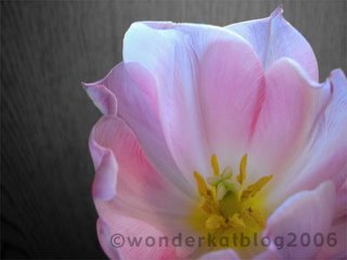
 Breakfast flower ~ 02.19.06
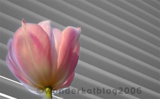
 Breakfast flower 2 ~ 02.19.06
Same tulip ... different background, different point of view. So, this morning during breakfast ... there was a vase with flowers on our table. The tallest of which, was this tulip. On the fly, I used what was immediately available for background material. But later decided that in order to draw the attention where it rightly belongs, to the flower, it might be fun to remove the color from the background. I hardly ever play with photoshop in this fun way, so it was a blast!
2 comments:
The colours really are glorious. It's a worthwhile study, focused on pink, white, and yellow, with hints of purple. A good idea to desaturate the backgrounds... though it suddenly makes them intersting as well! There's something about seeing something in pure tonal values that makes the eye take a little vacation there. What was your technique -- a hue/saturation adjustment layer masked to exclude the blossom?
Hi Lone -- With both of these photos, I started by changing the photos to black & white and saving them under a different file name. Then reopened the original files, selected the flower, feathered the selection and cut and pasted it onto the black & white version. Then flattened the layers.
Though I'm pretty sure there's probably an easier way to accomplish this goal, this was the way I worked it. : )
Post a Comment